.
Contemporary House Renovation
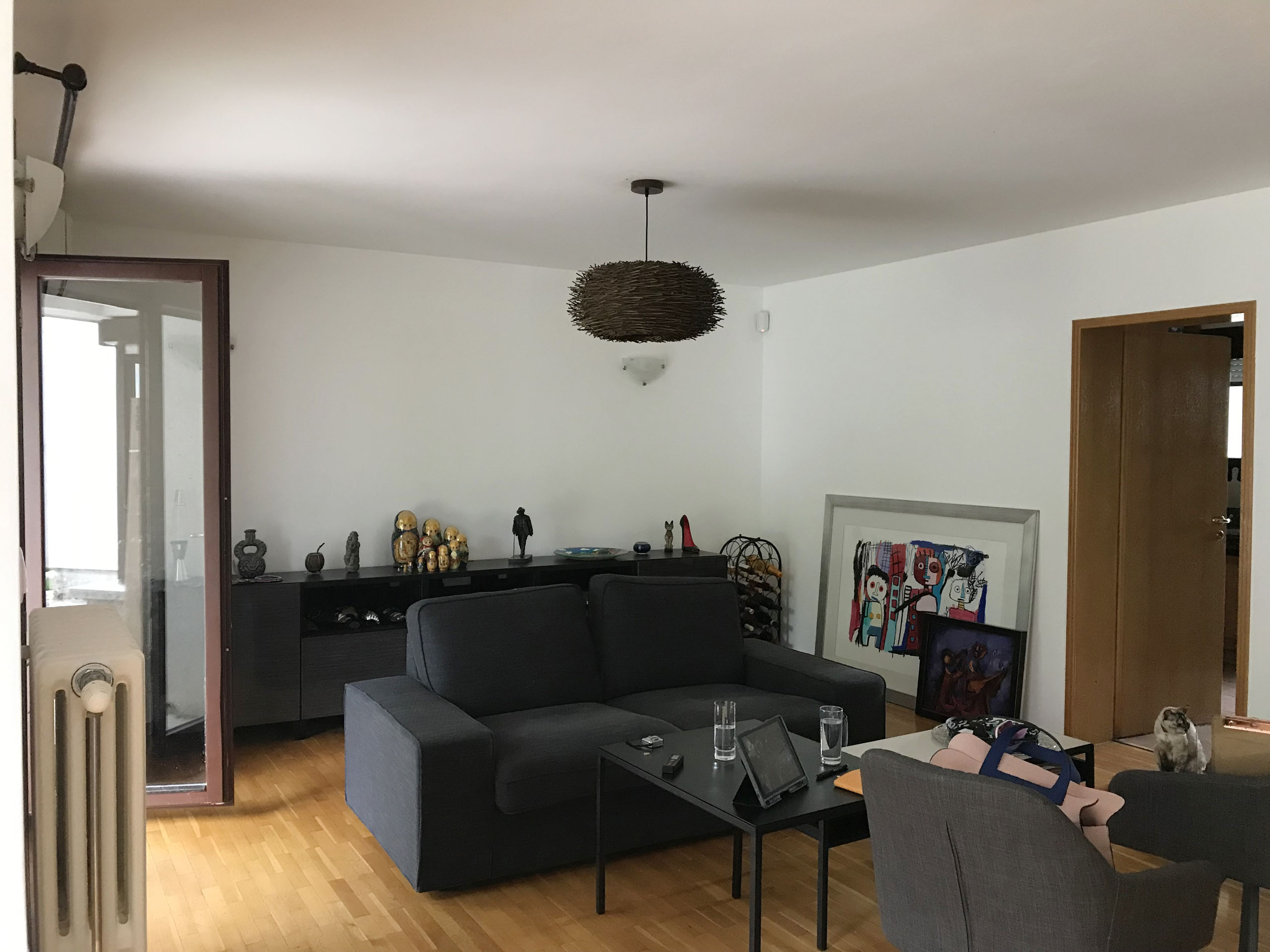
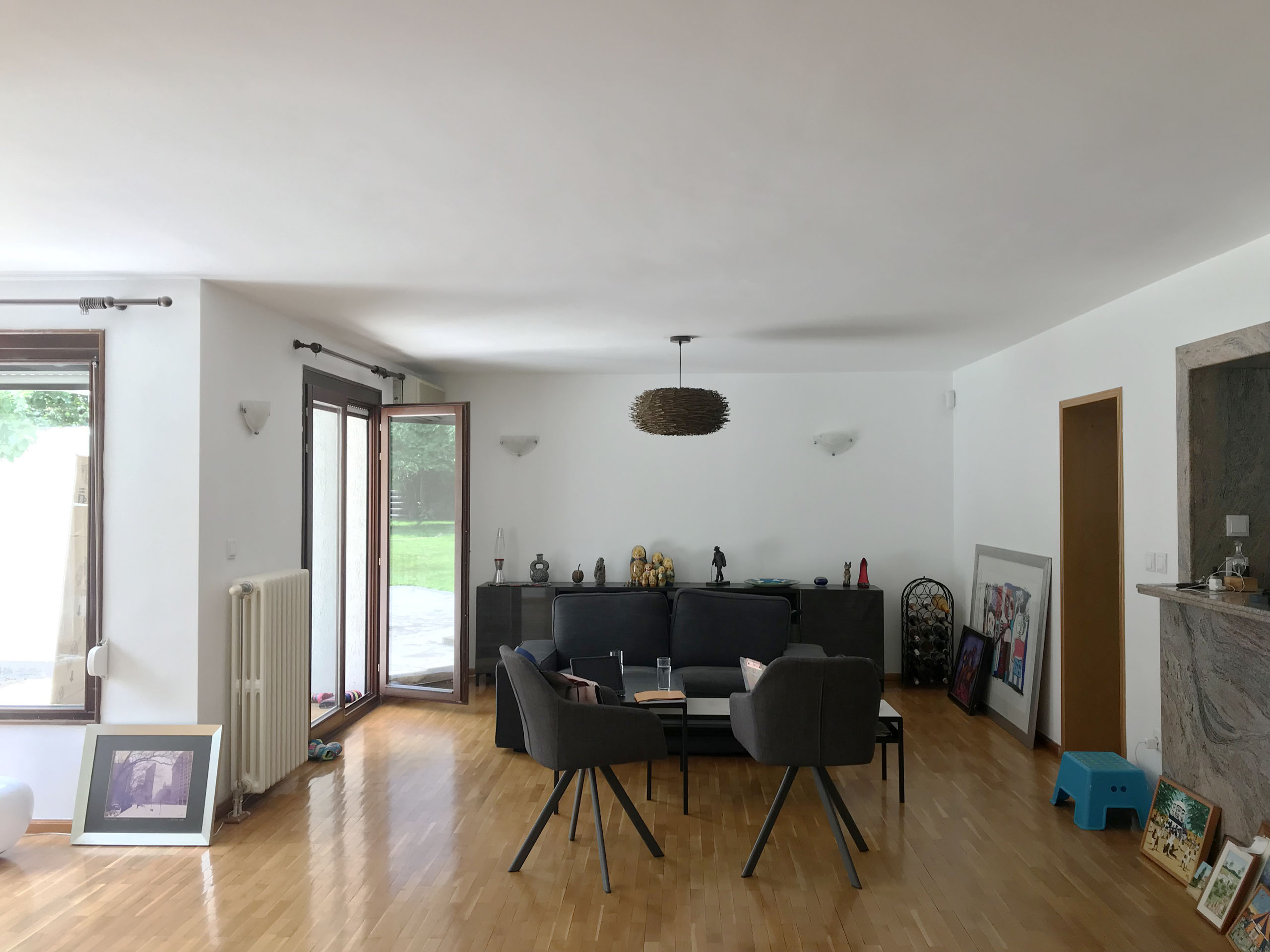
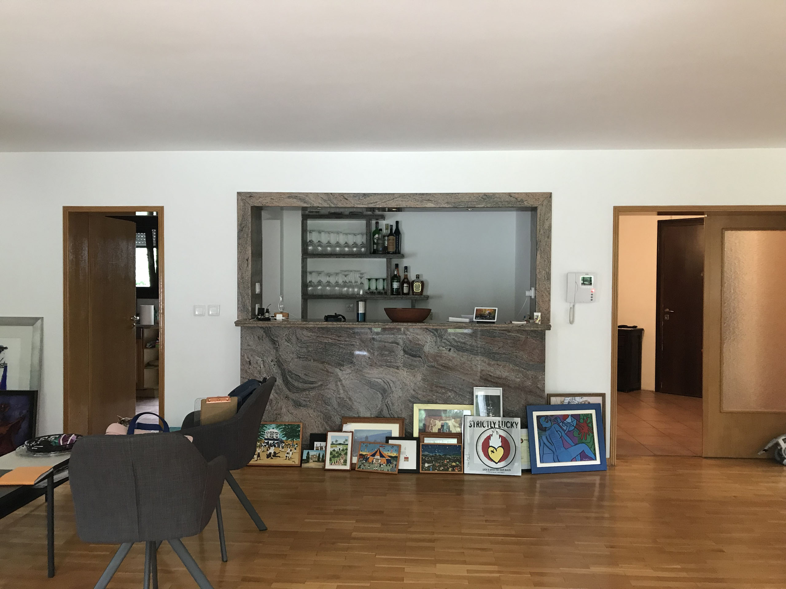
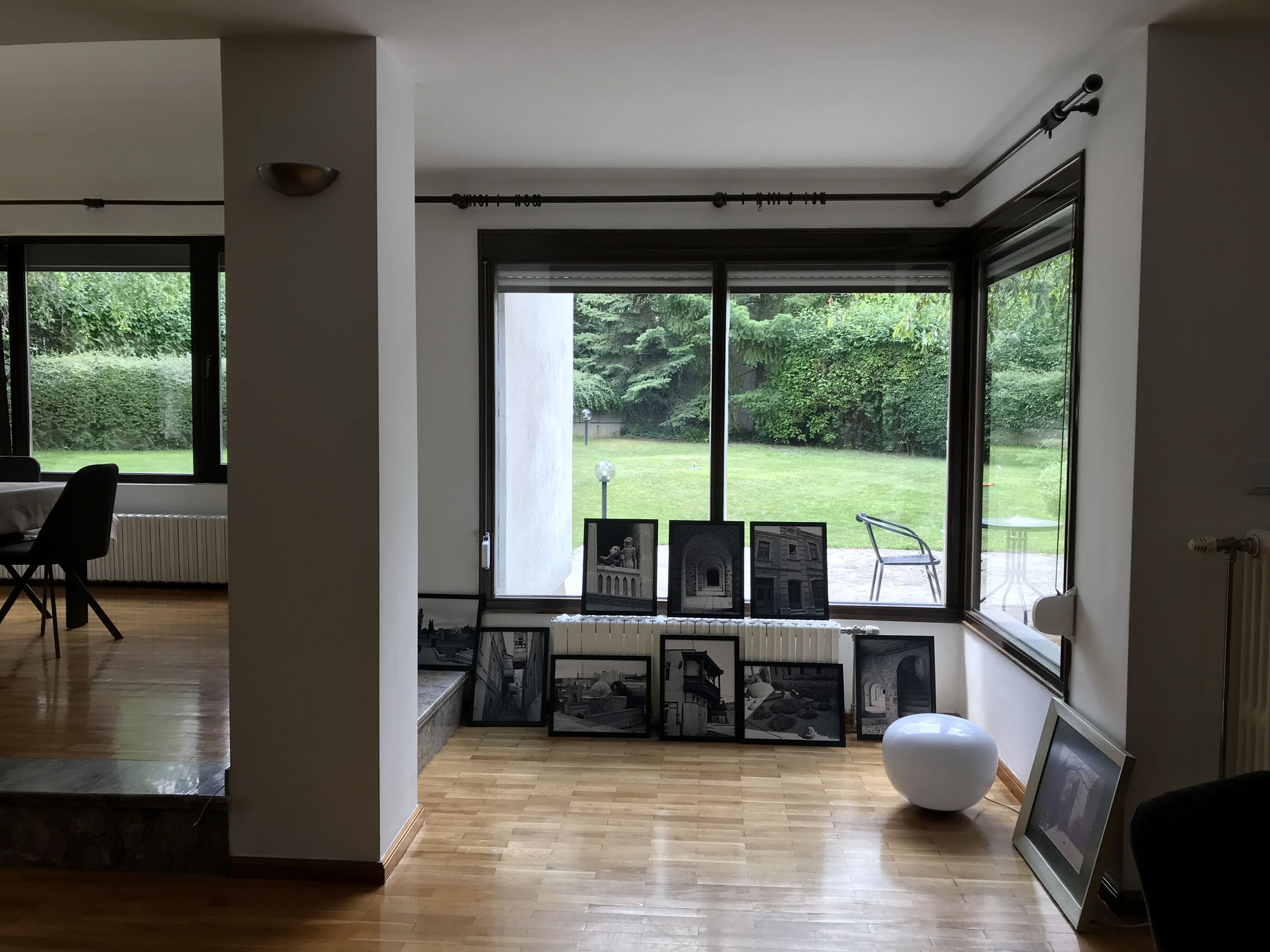
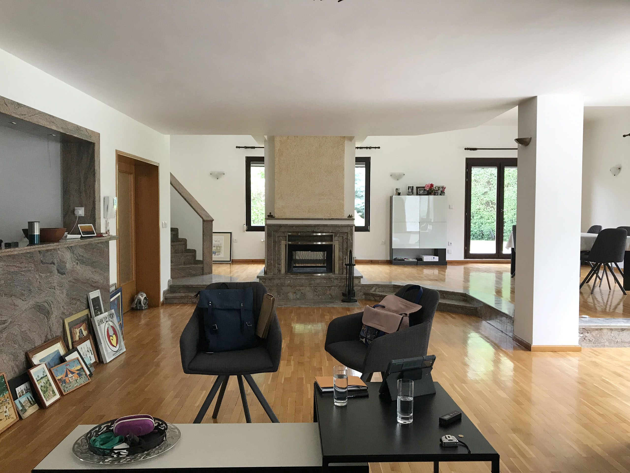
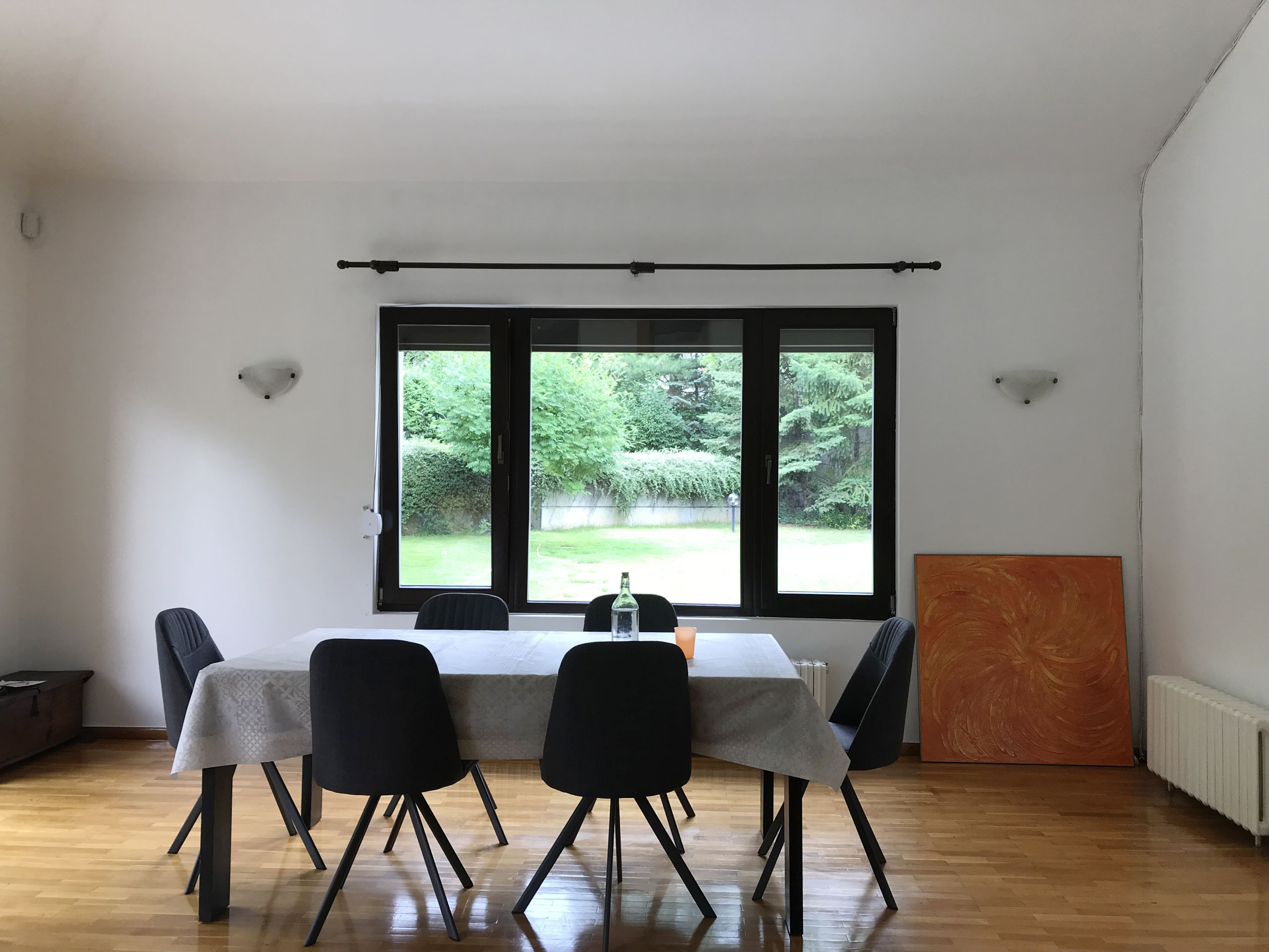
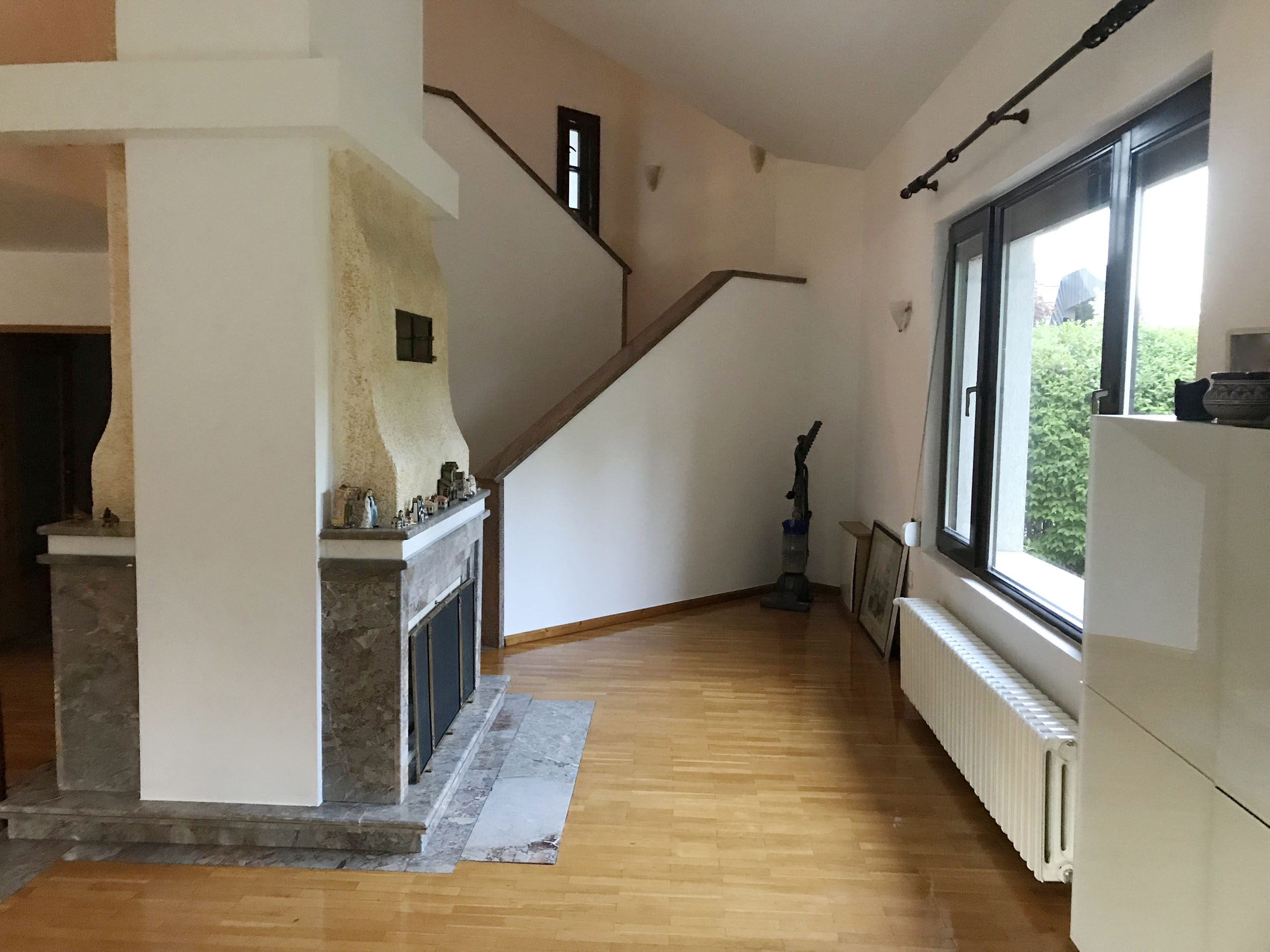
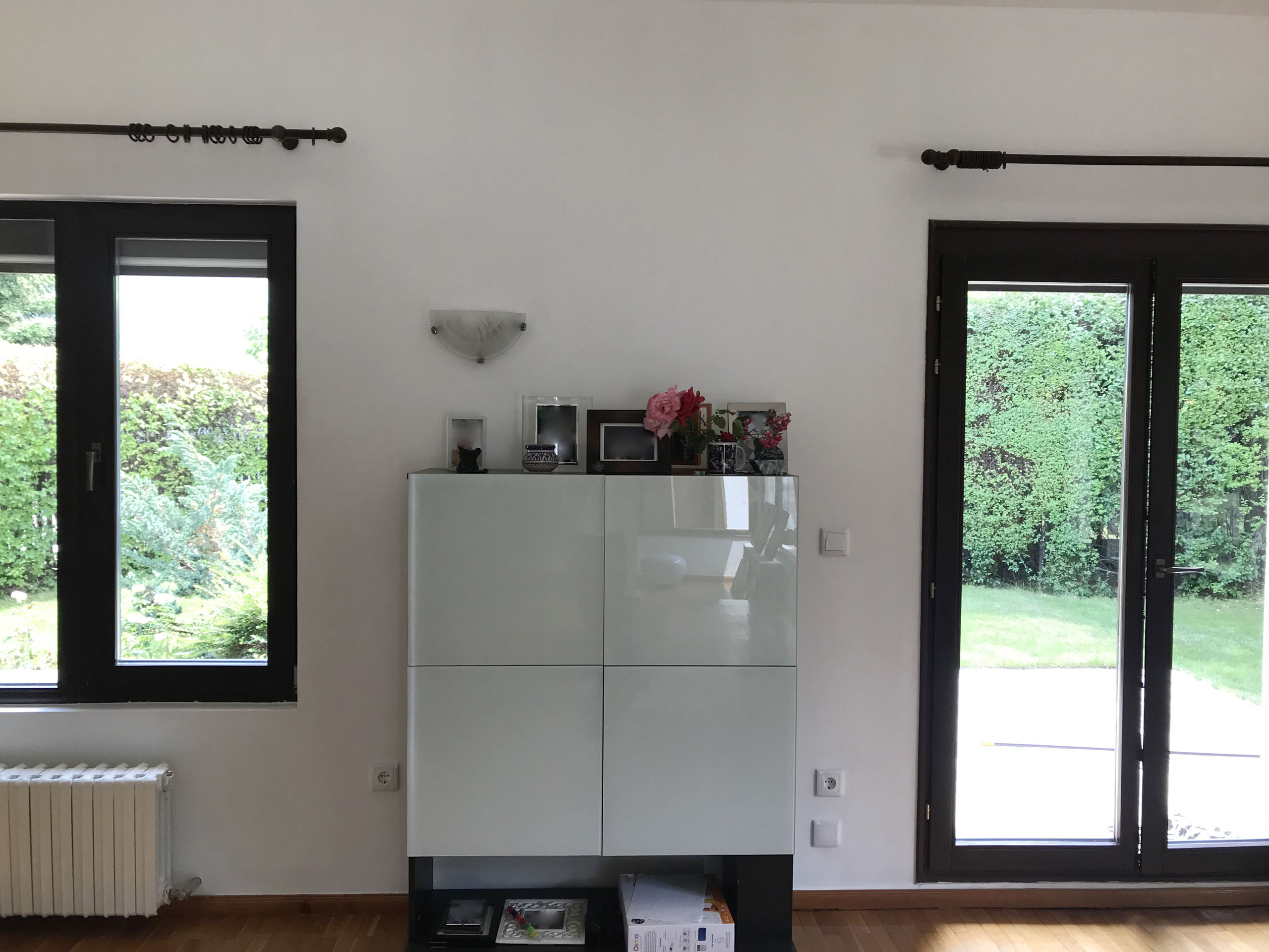
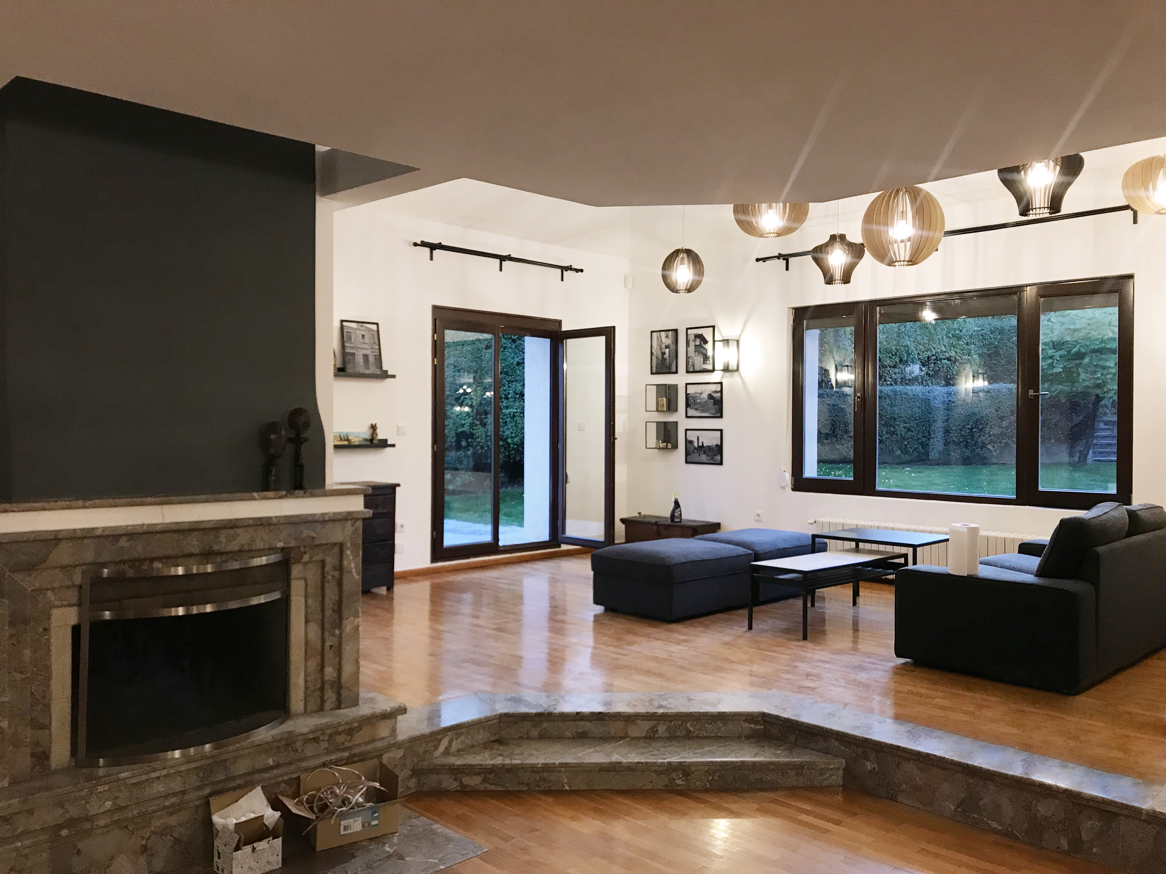
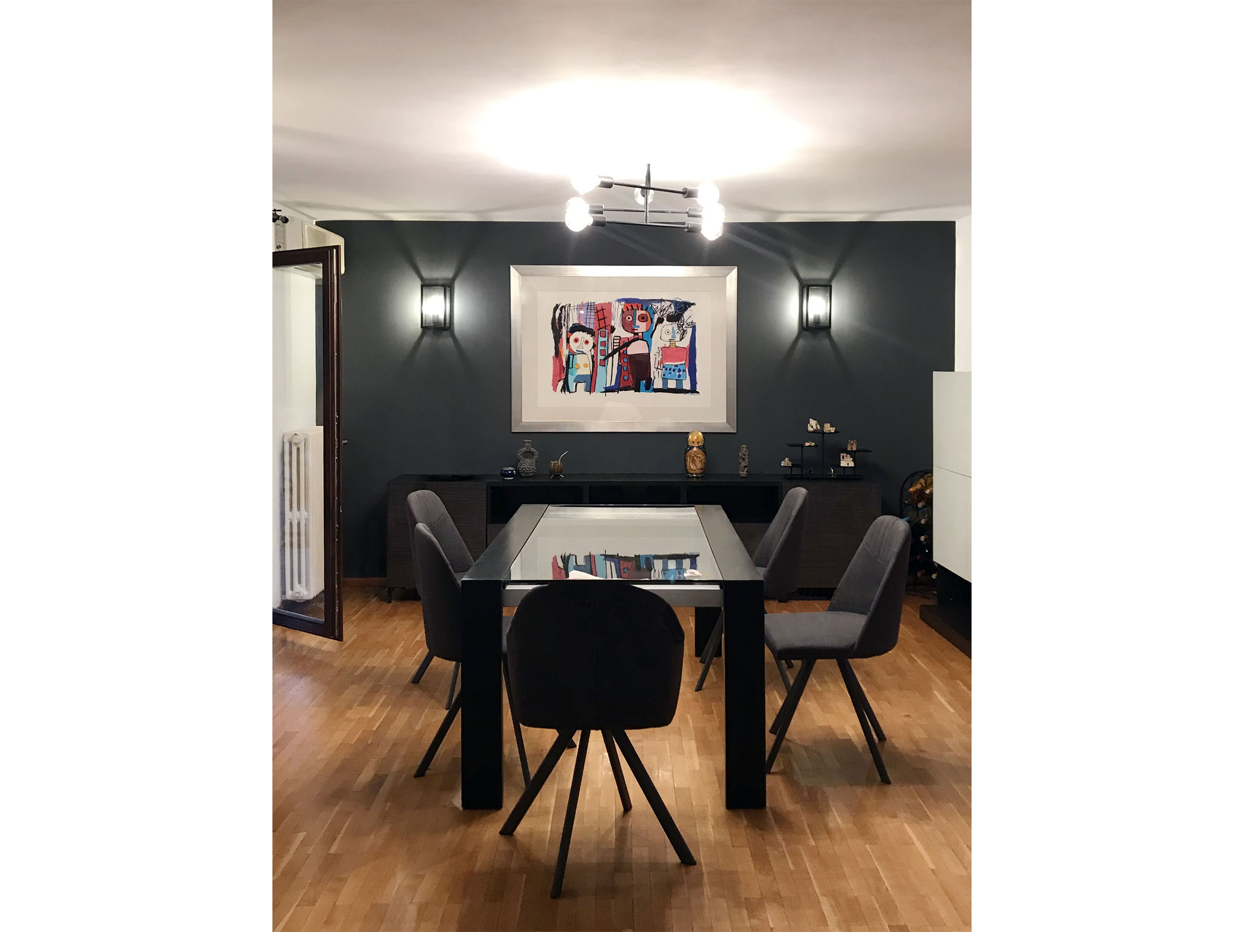
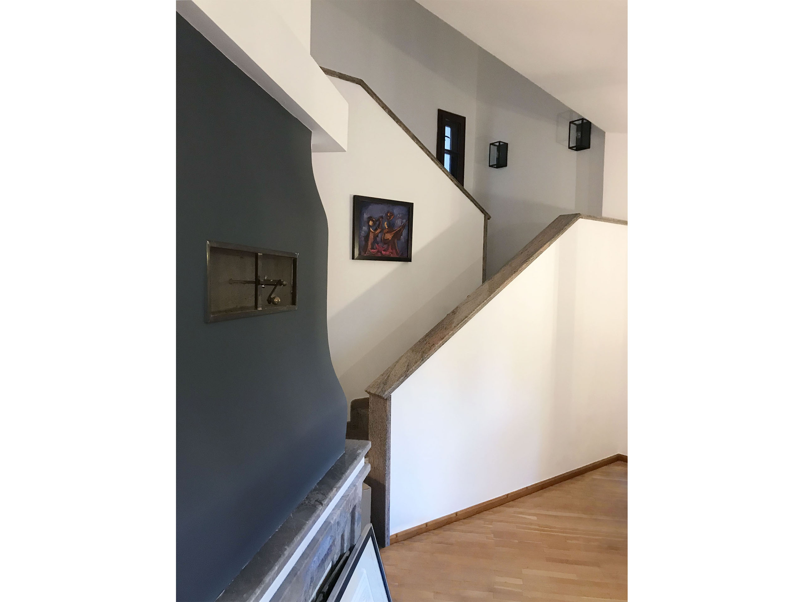
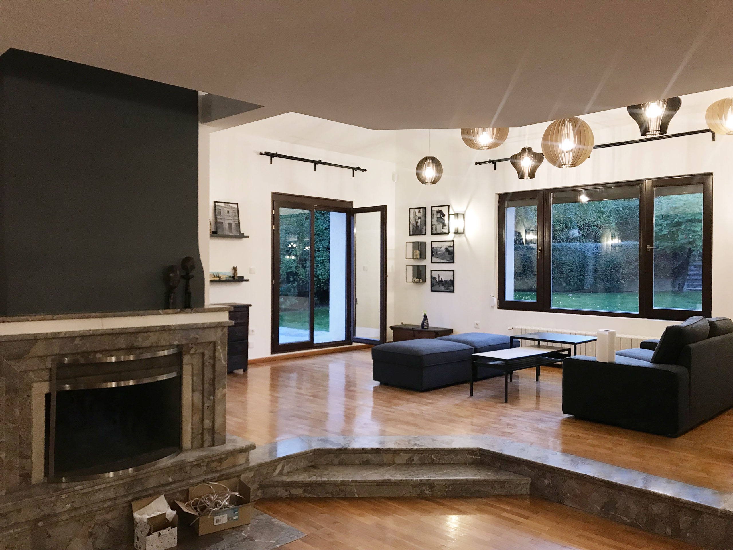
Even though hidden behind old-fashioned furnishings, darkness and decades without renovation, the potential of the space was obvious from the beginning. First thing on the agenda was to reorganize the space by switching the dining and lounge areas. This way the dining table would be closer to the kitchen and outdoor barbecue and the seating area would become more open and airy.
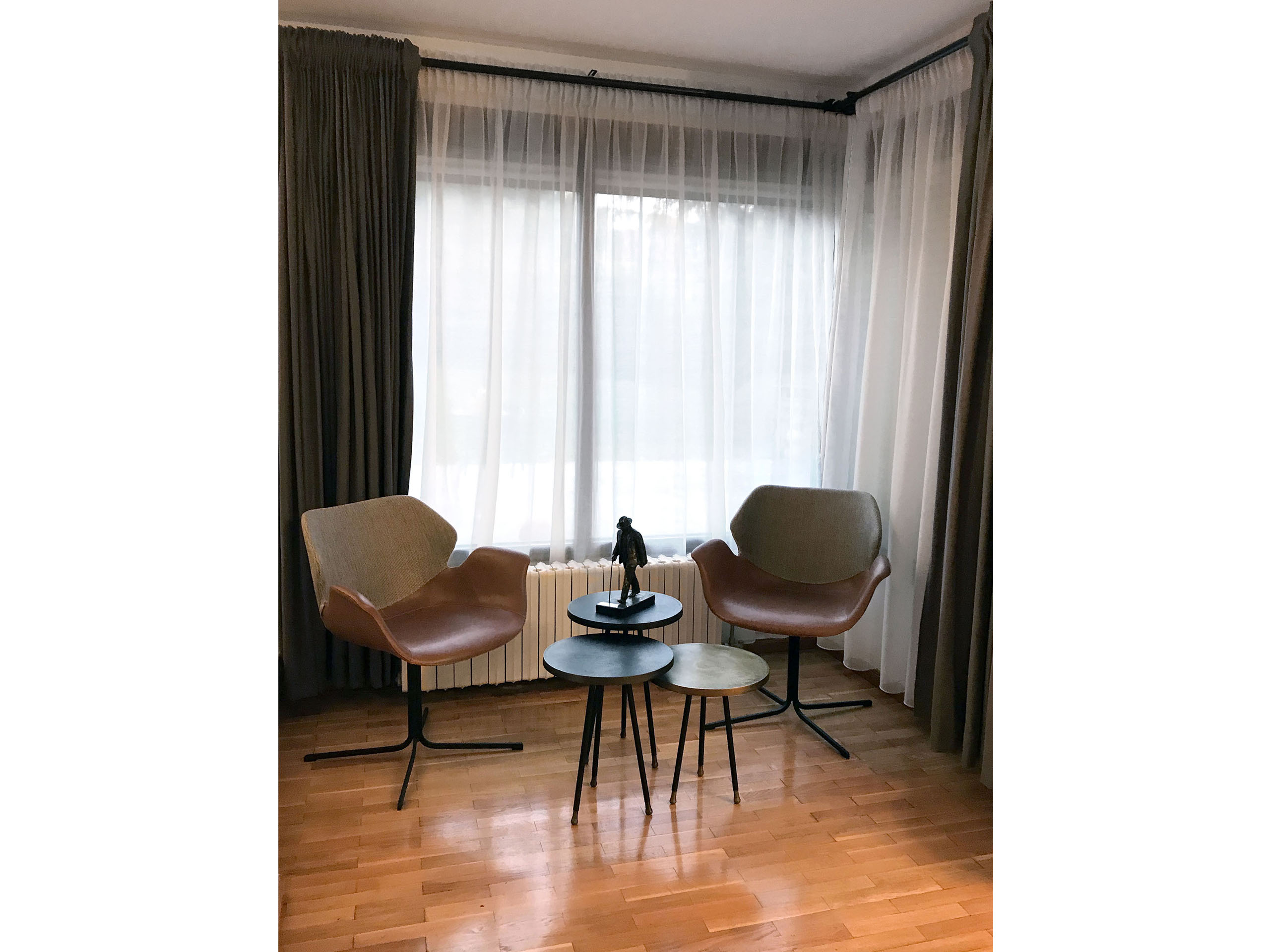
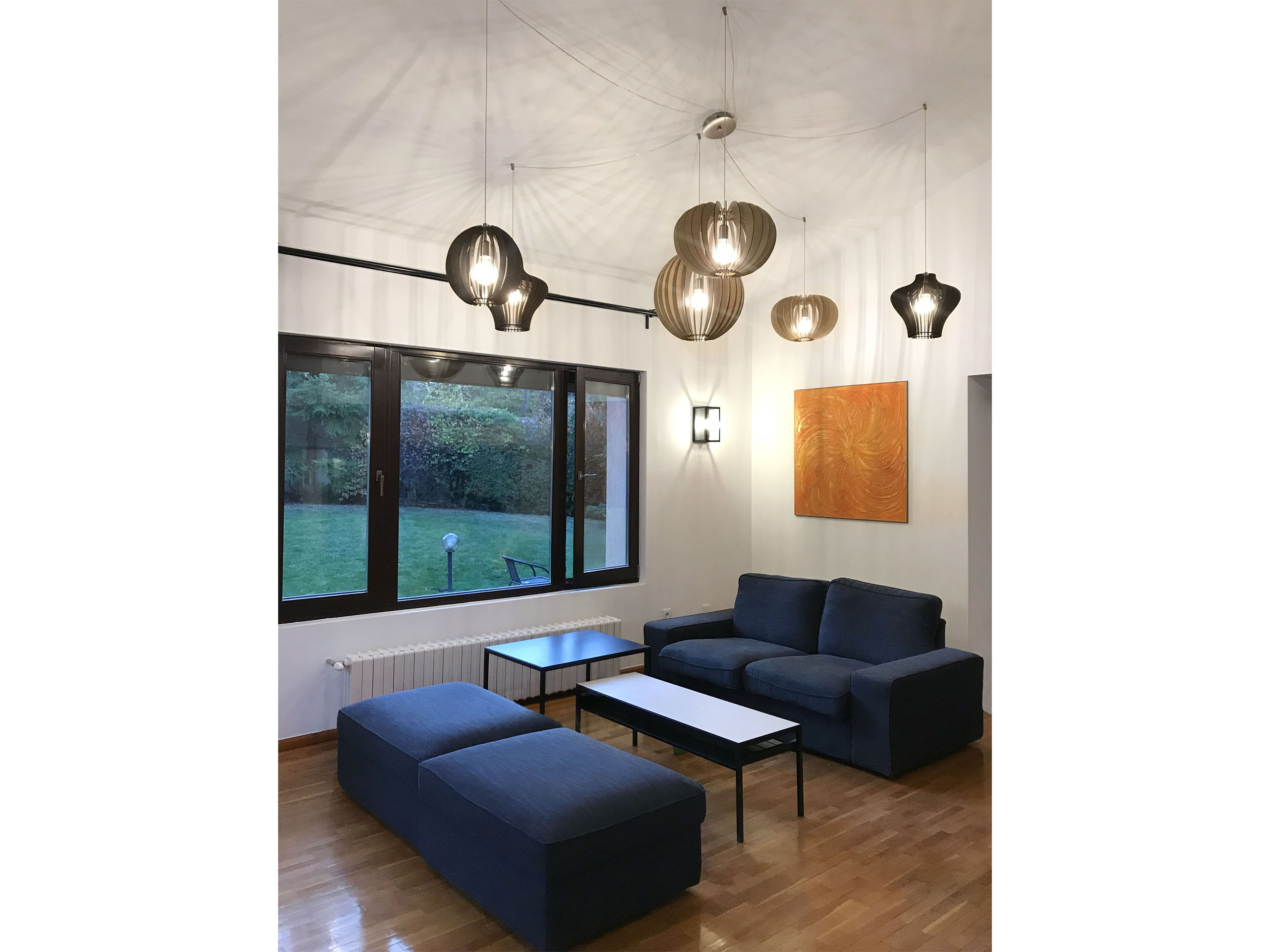
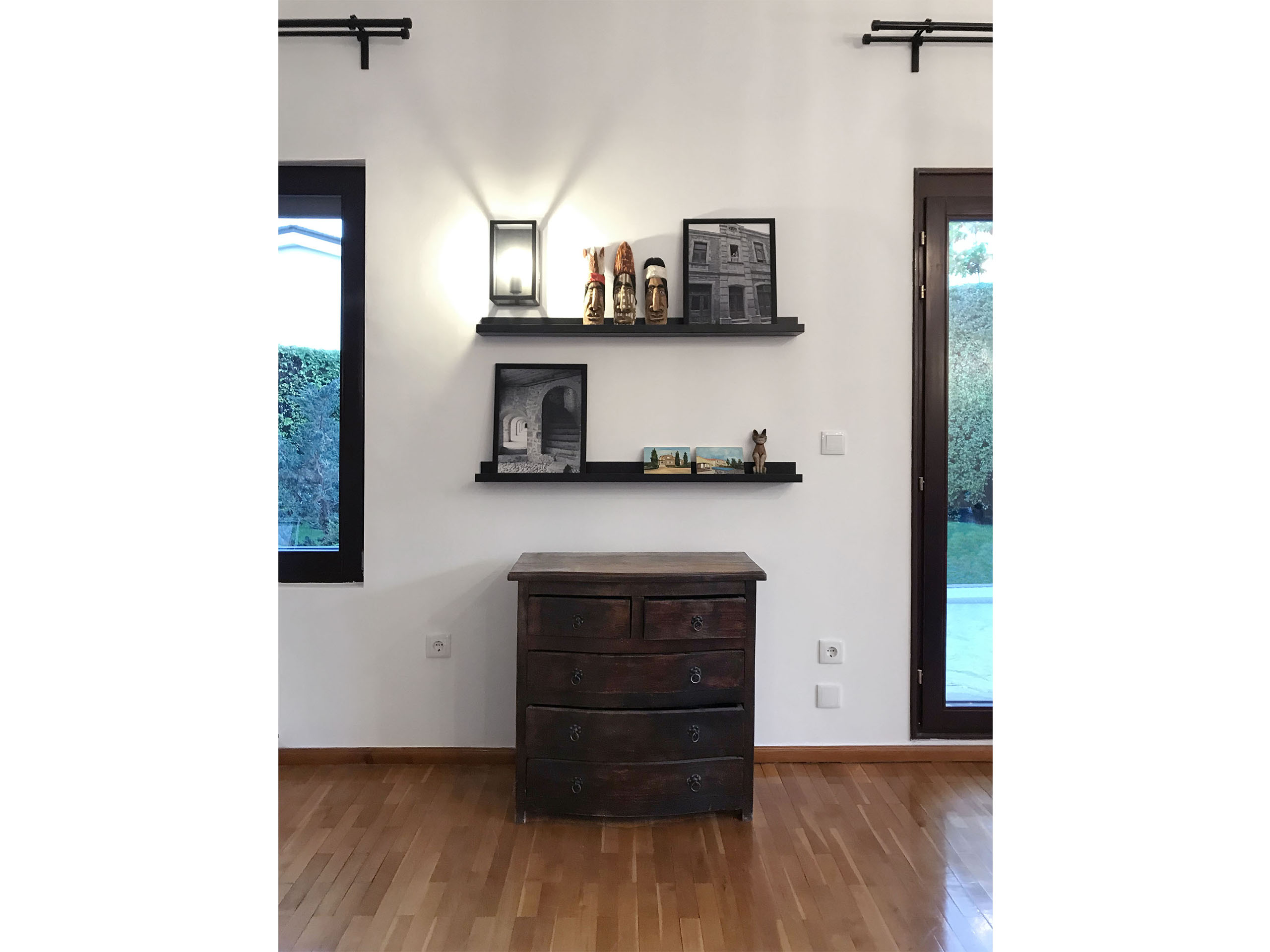
Since the clients were renting the house, the investment had to be minimal. We used most of the furniture the family already owned and added just a few items to complete the new aesthetic and bring a touch of modernity. Most of the new pieces were easy to transport, which made them a good long-term investment.
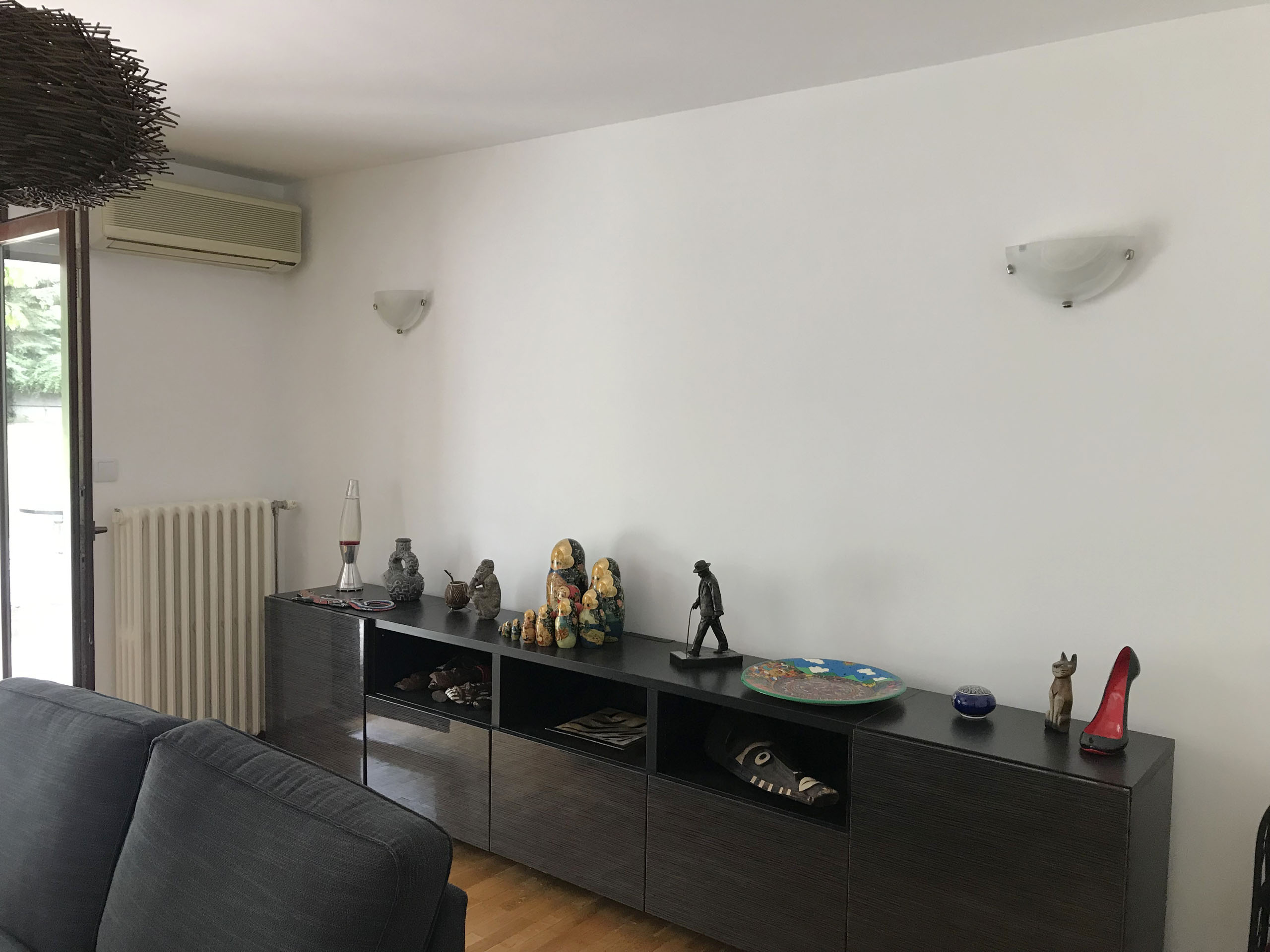
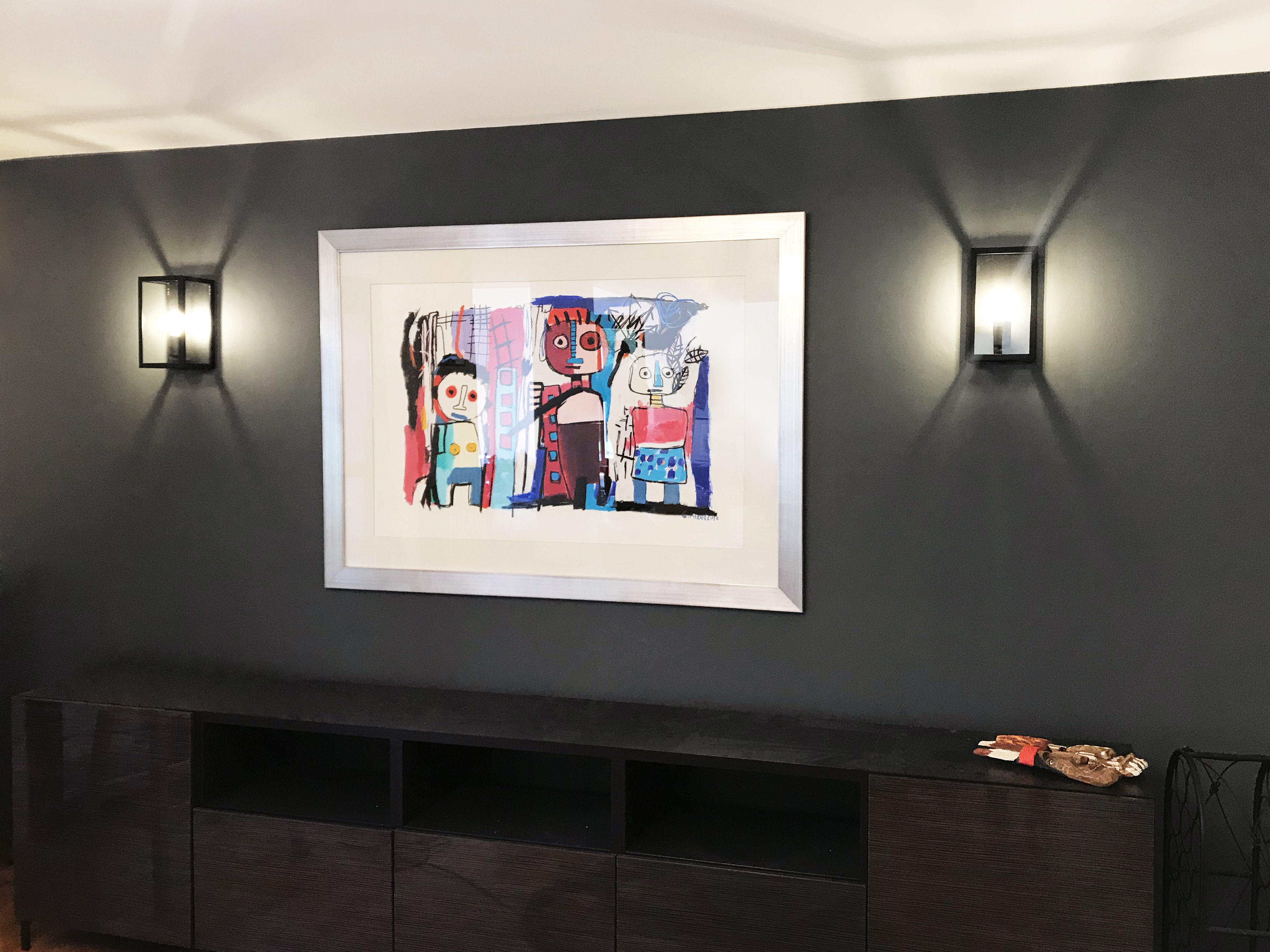
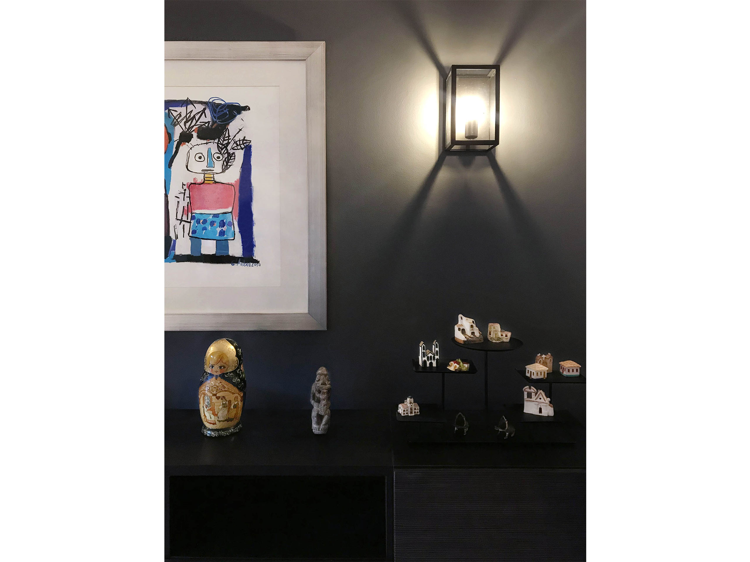
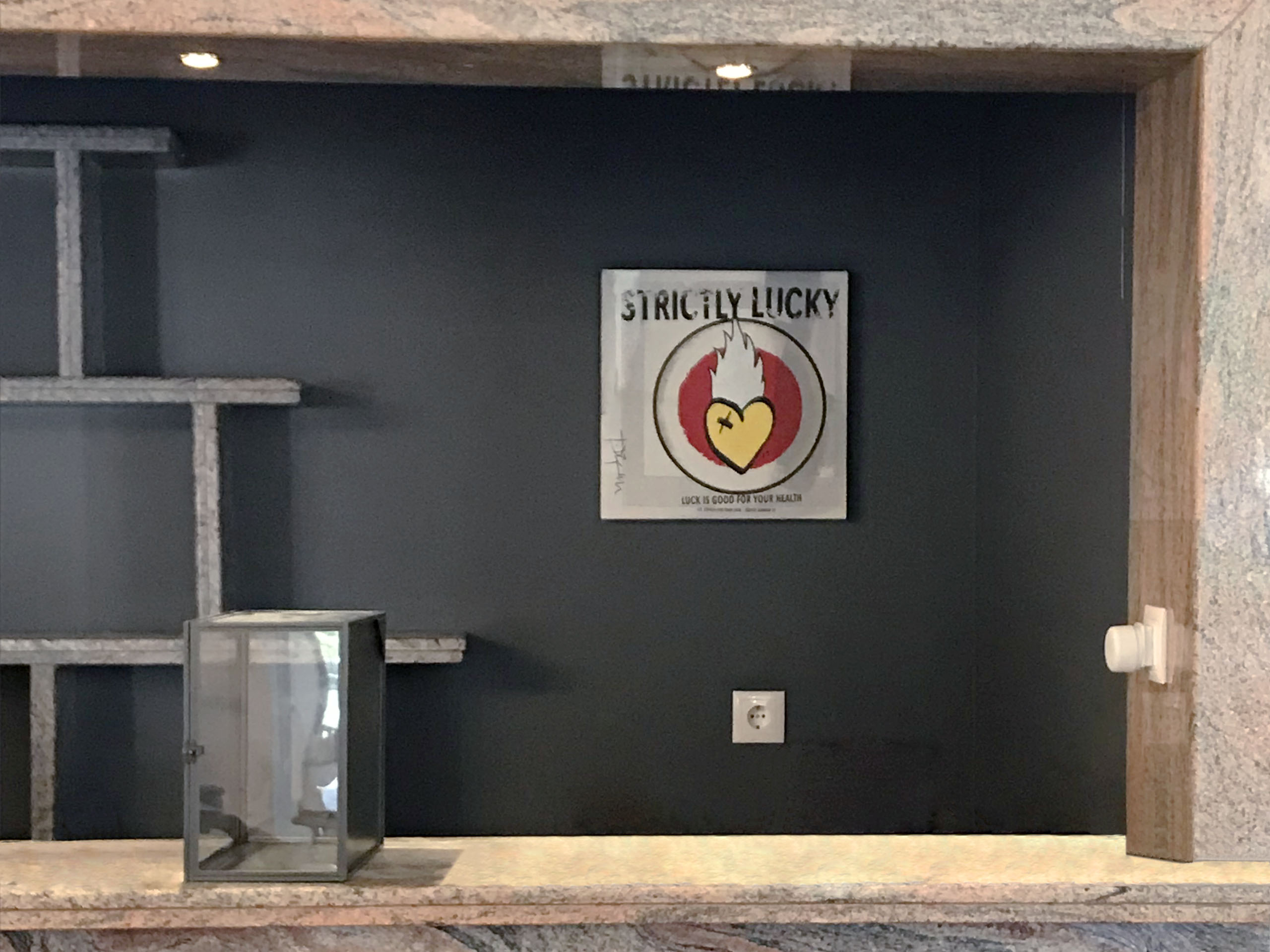
One of the biggest problems in this space was the lack of proper lighting, so changing the fixtures with more contemporary ones and with better parameters was crucial. We used paint as an inexpensive way to accentuate certain areas and make the beautiful art the star of the space. The shelving and wall decorations are from IKEA, as well as the sofa and ottomans. The whole project was very affordable and allowed us to completely change the look and functionality with just a few small steps.
The "after" photographs show the space before textiles such as carpets, curtains and cushions were delivered.
"BEFORE" PICTURES
